ISO 55000 asks an organisation to manage physical assets for value: to balance cost, risk and performance over the whole life of the asset, and to be able to show how a decision was reached. ISO 55001 turns that into requirements — the organisation must plan actions to address risks and opportunities, set out the criteria it uses to make decisions, and hold the information those decisions rest on. Most asset owners meet the letter of that with a risk matrix: likelihood one to five, consequence one to five, multiply, colour the cell. The matrix is where quantitative risk analysis usually stops, and it is exactly where the standard expects it to begin.
What a matrix cannot tell you
A five-by-five matrix is a ranking device. It can say that pump station B looks worse than valve chamber C. It cannot say by how much, it cannot say what that difference is worth in money or in hours of lost supply, and it cannot say what the risk becomes if you replace one of them and leave the other. Those are the questions a renewal budget, a business case or a regulator actually asks. They need numbers with units, and they need the uncertainty in those numbers to be visible rather than rounded away.
Quantitative risk analysis means treating likelihood and consequence as distributions, not scores. A pump does not have a failure likelihood of “3”; it has a probability of failing in the next year that depends on its age, condition and duty, and that probability is itself uncertain. A failure does not have a consequence of “4”; it costs something between a quiet afternoon and a district without water, depending on when it happens and what else is out at the time.
Why the expected value is not enough either
The obvious first step beyond the matrix is to multiply a probability by an average cost and call it expected annual risk. It is a real improvement and it is still not enough, for three reasons that show up in practice.
- Budgets are set against years, not averages. A figure that is right on average is exceeded in a predictable share of years. The year that matters for storage, spares and contingency is the bad one, and the average hides it.
- Consequences are not linear. A failure during peak demand, or while the standby is already out for maintenance, costs far more than the same failure on a quiet night. Averaging across those cases before you multiply throws away the interaction that produces the tail.
- Assets interact. Redundancy, common causes such as a heatwave or a supplier delay, and network topology mean the risk of a system is not the sum of the risks of its parts. Nobody can add those effects up by hand across a few hundred assets.
What Monte Carlo simulation actually does
The method is simpler than its reputation. Build a model of the system — the assets, how they fail and are repaired, how a failure turns into a consequence. Then, instead of feeding it single best-guess values, feed it values drawn at random from each input’s distribution, run the model for one simulated year, and record what happened: how much was not delivered, how many hours of outage, what it cost. Repeat several thousand times. The collection of recorded years is the answer. Its median is a normal year; its 95th percentile is the year you must be able to absorb; its shape tells you whether risk is a steady drizzle of small events or a rare, heavy one.
Because every simulated year is a full run of the model, interactions come for free. If two pumps share a standby, the years in which both fail during the standby’s outage appear in the results at the frequency the inputs imply, without anyone having to work out that combination in advance. That is the property that makes the method worth the effort on networks and stations, and largely unnecessary for an isolated asset.
The inputs, and where they come from
A simulation is exactly as honest as its distributions. Four are usually enough to start:
- Time to failure for each asset class — typically a Weibull or similar ageing curve, fitted to your own failure history where it exists and to manufacturer or industry data where it does not, then shifted by observed condition.
- Time to repair — from work-order records, which are almost always skewed: most repairs are quick, a few take weeks waiting for a part. A lognormal fits better than an average.
- Consequence per hour of failure — demand not served, production lost, penalty exposure, expressed in the unit the organisation actually manages.
- Dependencies — which assets back each other up, which share a cause, and which sit upstream of which. This is the topology, and it is where most of the tail risk lives.
Document each source. ISO 55001’s information requirements are not bureaucracy here; they are what lets an auditor, a regulator or your successor trace a number in a capital plan back to the failure records it came from.
Reading the output
The result is a distribution, and the discipline is to report it as one. Three views do most of the work:
- Percentiles — the P50 for planning a normal year, the P95 (or the percentile your risk appetite names) for what you must be able to withstand. Risk appetite becomes a testable statement: “no more than X hours unserved at P95”.
- Contribution — which assets appear most often in the bad years. A component that fails rarely but drags the whole system with it ranks high here and low in a matrix.
- Value of an intervention — re-run the simulation with an asset renewed, a standby added or a spare held, and read the shift in the distribution. The reduction in expected loss, set against capital cost and discounted, is the number a business case needs.
Check convergence before believing any of it: plot the estimate against the number of iterations and confirm it has settled. If it is still drifting at ten thousand runs, the tail is heavier than the model expected and the answer is not yet an answer.
Where it goes wrong
- False precision. A distribution invented to look rigorous is worse than an honest range. Report outputs with the same candour as the inputs deserve.
- Independence by default. Treating every failure as independent underestimates the tail, sometimes badly. If a summer heatwave raises the failure rate of every pump at once, the model has to know.
- Modelling the asset instead of the service. The consequence that matters is the service not delivered, not the fact that a component stopped. The model must contain enough of the system to connect one to the other.
- Reporting the mean. If the executive summary shows one number, the whole exercise collapses back into a scored register with extra steps.
Fitting it into the asset management system
In an ISO 55000 framework the simulation is not a one-off study. Its outputs feed the strategic asset management plan and the decision-making criteria; its inputs are refreshed as condition monitoring and work-order data arrive, so the failure curve for a pump moves as that pump’s own vibration trend moves; and its results are reviewed on the same cycle as the plan they inform. Exporting the scenario and its results with each run gives the audit trail the standard expects and lets the numbers be checked by someone who was not in the room.
This is the approach behind Keystone RISKSYS for water networks: draw the network as it is built, give each asset its failure and repair behaviour, and let the simulation find which component actually dominates the risk. The companion note explains why that ranking so often disagrees with the register.
The short version
A matrix tells you which assets look bad. A simulation tells you what a decision is worth. ISO 55000 asks for the second, and the tools to provide it now run in a browser.
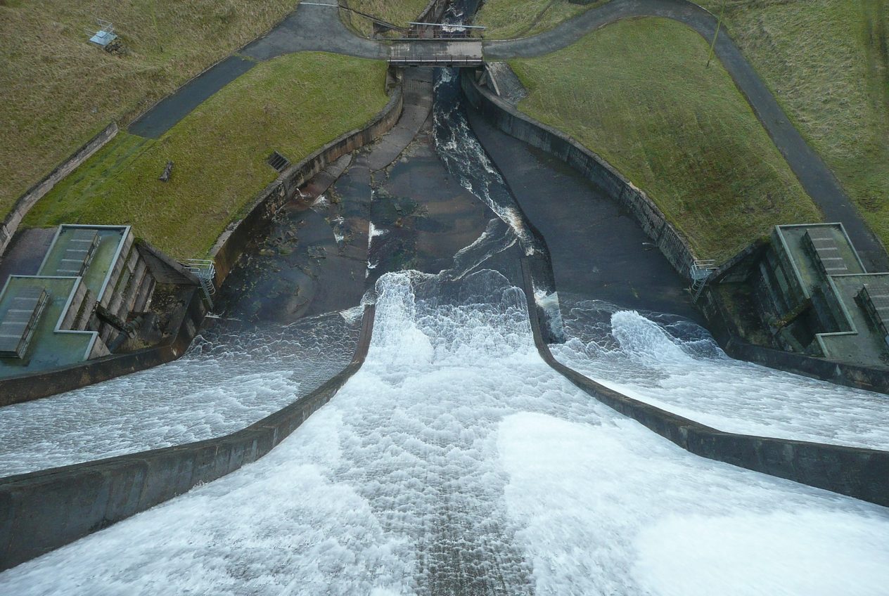
Images: Colombo Express in Altenwerder at night-799096 by Martin Damboldt, CC0, via Wikimedia Commons; Baitings Reservoir spillway in action - geograph.org.uk - 2773417 by Humphrey Bolton, CC BY-SA 2.0, via Wikimedia Commons.